UPCOMING WEBINAR 5/22: Medical device internal auditing tips 💻
THE QUALIO PLATFORM
#1 eQMS for life sciences
Drive a faster and stronger route to market
Digitize and organize your entire stack
Pinpoint, prevent & resolve risks
Track and demonstrate competence
Manage any change easily & effectively
Become 100% audit-ready
Drive continuous improvement
Manage suppliers with ease
See your quality landscape at a glance
Keep your product compliant
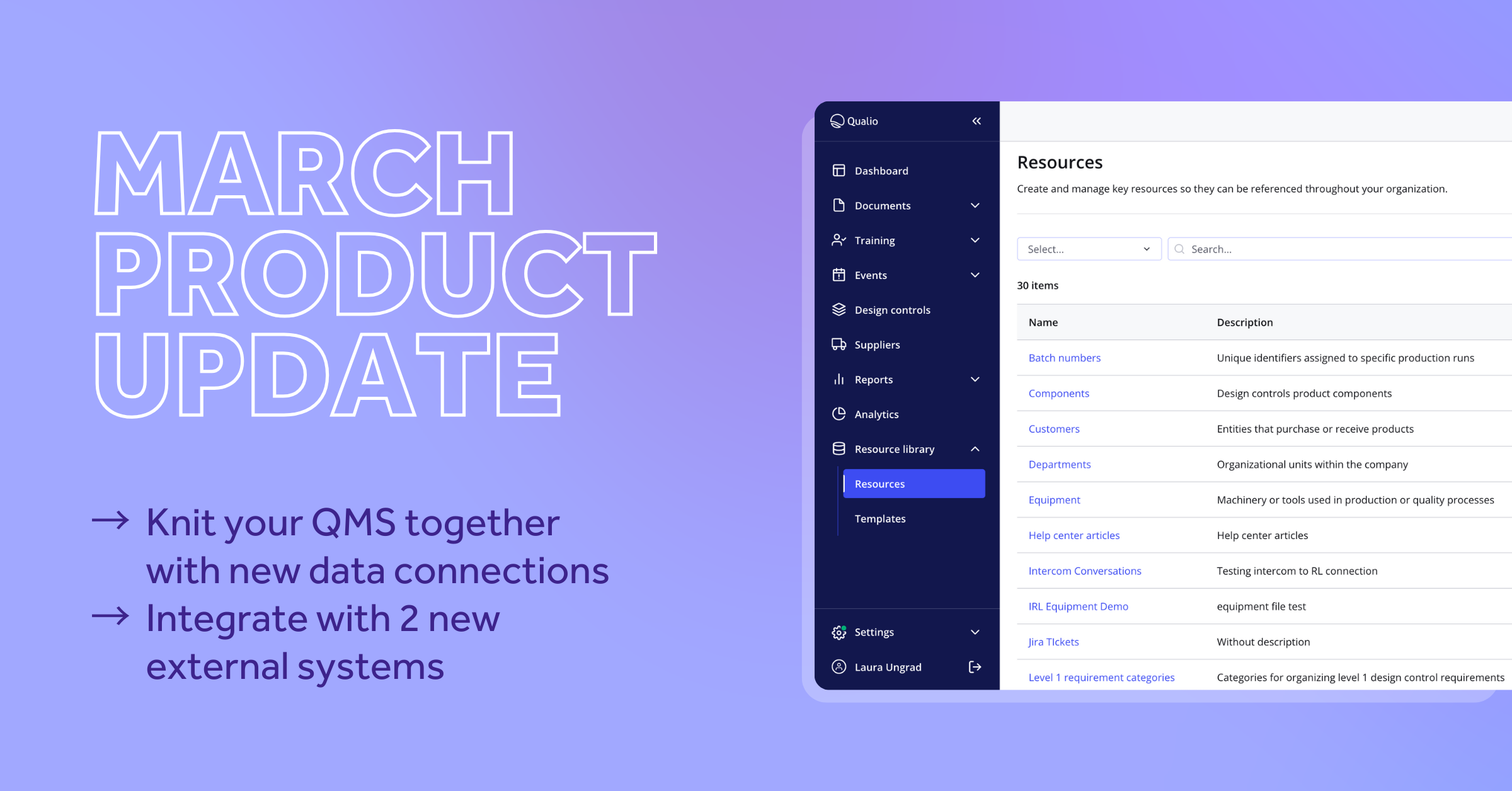
Connect your QMS information
PRODUCT TOUR
Click through an interactive demo
OUR SOLUTIONS
An integrated eQMS to help you hit your goals
Get to market faster with unshakeable quality
Ditch the clutter and chaos by going digital
Embed quality into the core of your SaMD development
Meet your requirements from 9001 to 13485
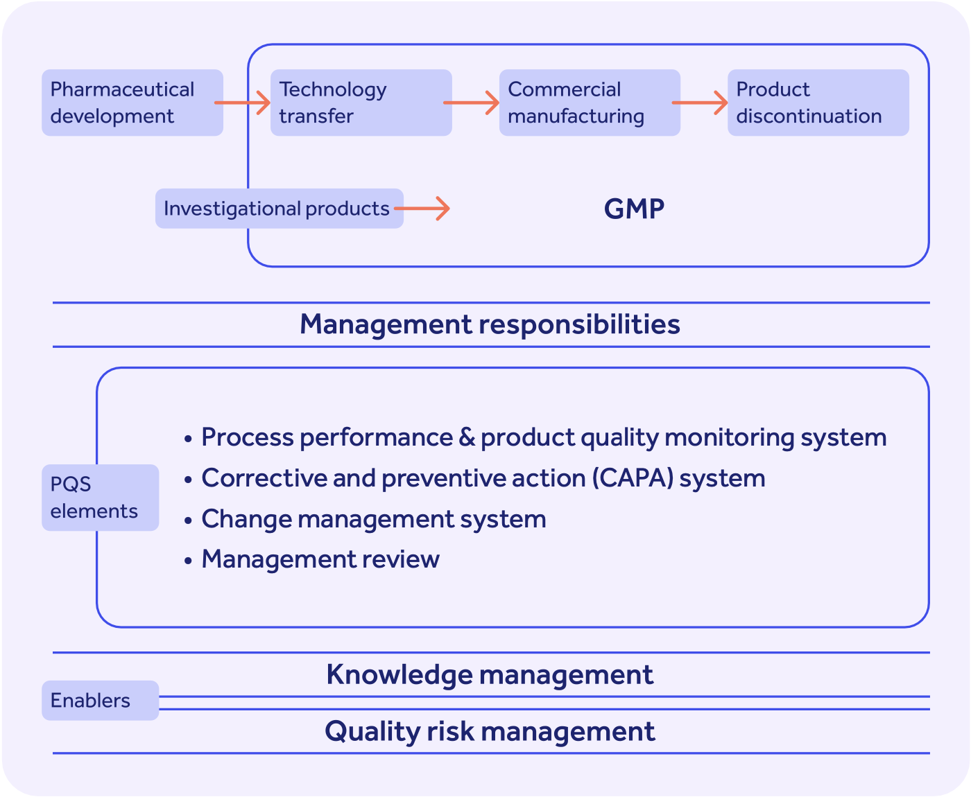
Build a world-class pharma quality system
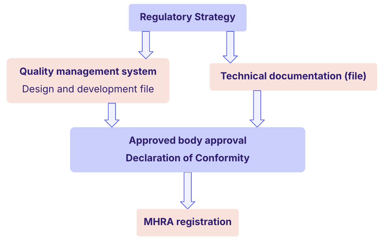
Bring your medical device to the EU and UK
Drive life-saving, industry-leading products
Unlock the US market by satisfying the FDA
Grow regulatory trust and distribute with confidence
Embed international pharma best practice
Provide compliant, quality-driven life science services every time
QUALIO INTEGRATIONS
Qualio integrates with your key business critical applications.
CUSTOMER SUCCESS STORIES
Learn how companies like yours use Qualio
Hear what our customers say about us
Love Qualio? Spread the word!
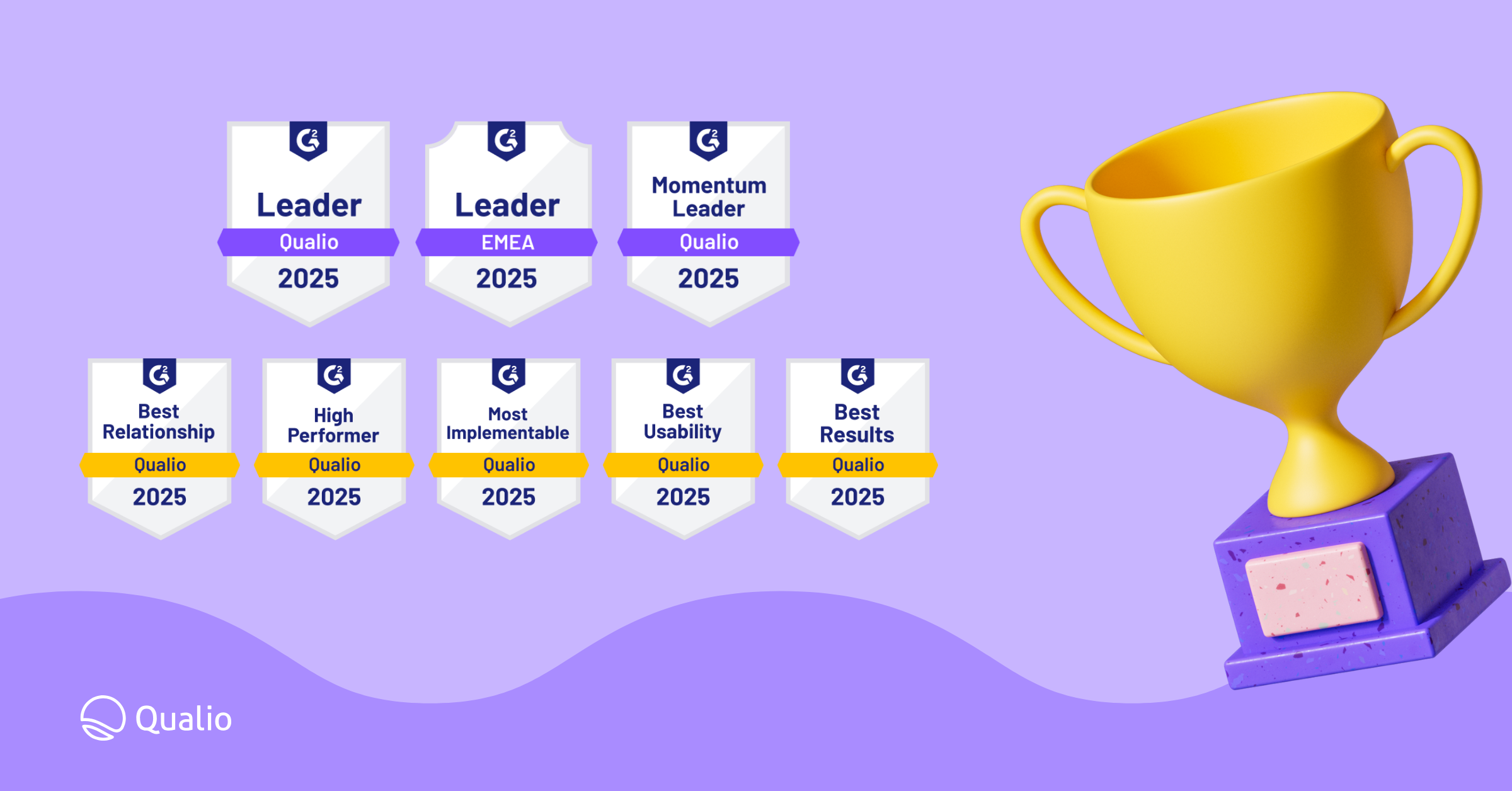
QUALIO G2 REVIEWS
Hear from real Qualio customers right now
EXPLORE OUR RESOURCES
View guides, toolkits, podcasts, and more
Access tips, tools and insights from real quality professionals
Join us at our online & in-person events
Search our network for quality expertise near you
CALCULATE YOUR ROI
See how much money Qualio can save you by sharpening your quality processes
ABOUT US
Learn about our company, people & investors
Come join the team
Become our partner today
Get in touch with us
GET YOUR QUALITY SCORE
Evaluate your quality maturity with our quick quiz
Get tips and advice on launching and scaling life-saving products, and building a quality-centric company.